
How Coffee Cup Colours Affect Your Drinking Experience
Cross-modal perception of colours on the taste of coffee
The Perception of Colours Affecting our Coffee Drinking Experience
Journal Article by Homeground Coffee Roasters - Specialty Coffee Roasters in Singapore
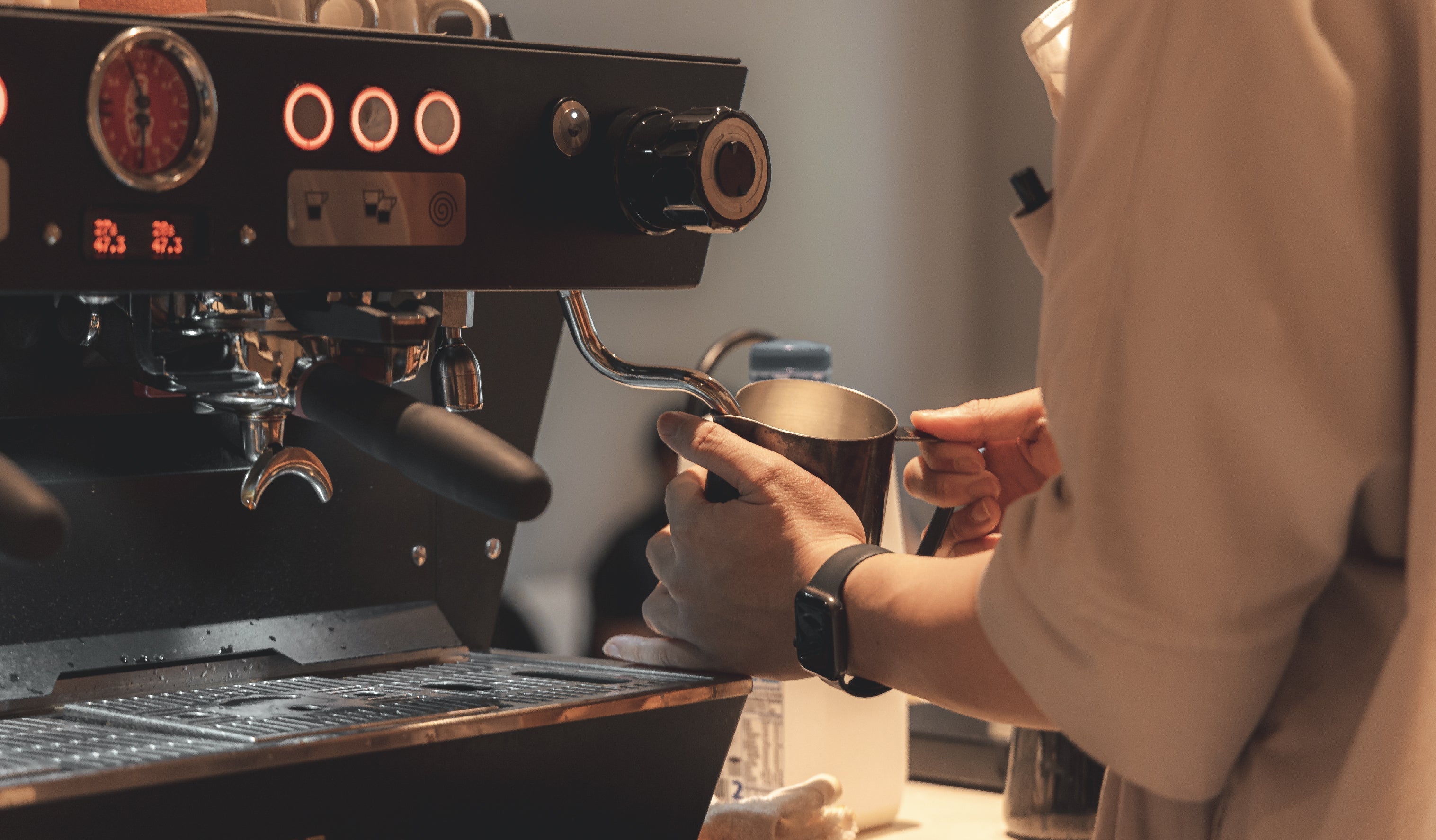
It may not be the first time that you have heard of this, but colour shapes the way that we perceive the world around us. From identifying depth, to influencing emotions, colours play an important role in shading our everyday activities. The effects of colour also apply to our experience with specialty coffee; both filter coffee and espresso-based coffee, for better or for worse.
Many studies have proven the effects of colour on coffee. This can depend on where we drink it or the drinking vessel we use. Our experience with coffee changes with different colours.

Applications of Cross-modal Perception
This idea is called Cross-modal perception; when two or more senses work together, they can affect each other. Recent research on this topic has shown interesting results. It reveals that colour cues influence more than just the object's features. They also influence outside factors that are not part of the object itself.
Spence, Velasco and Knoeferle (2014) showed that environmental factors such as colour of lighting and type of music, have a significant influence in the perception of wine. Gueguen and Jacob (2014) studied drinking vessels where found that people linked “warmth quality” to the colous of the vessels. Mielby et al. (2018) discovered that red vessels seemed to have more carbonation, in context of flavoured carbonated drinks.
Saluja and Stevenson (2018) also conducted a study matching an individual’s experiences of taste to colour.
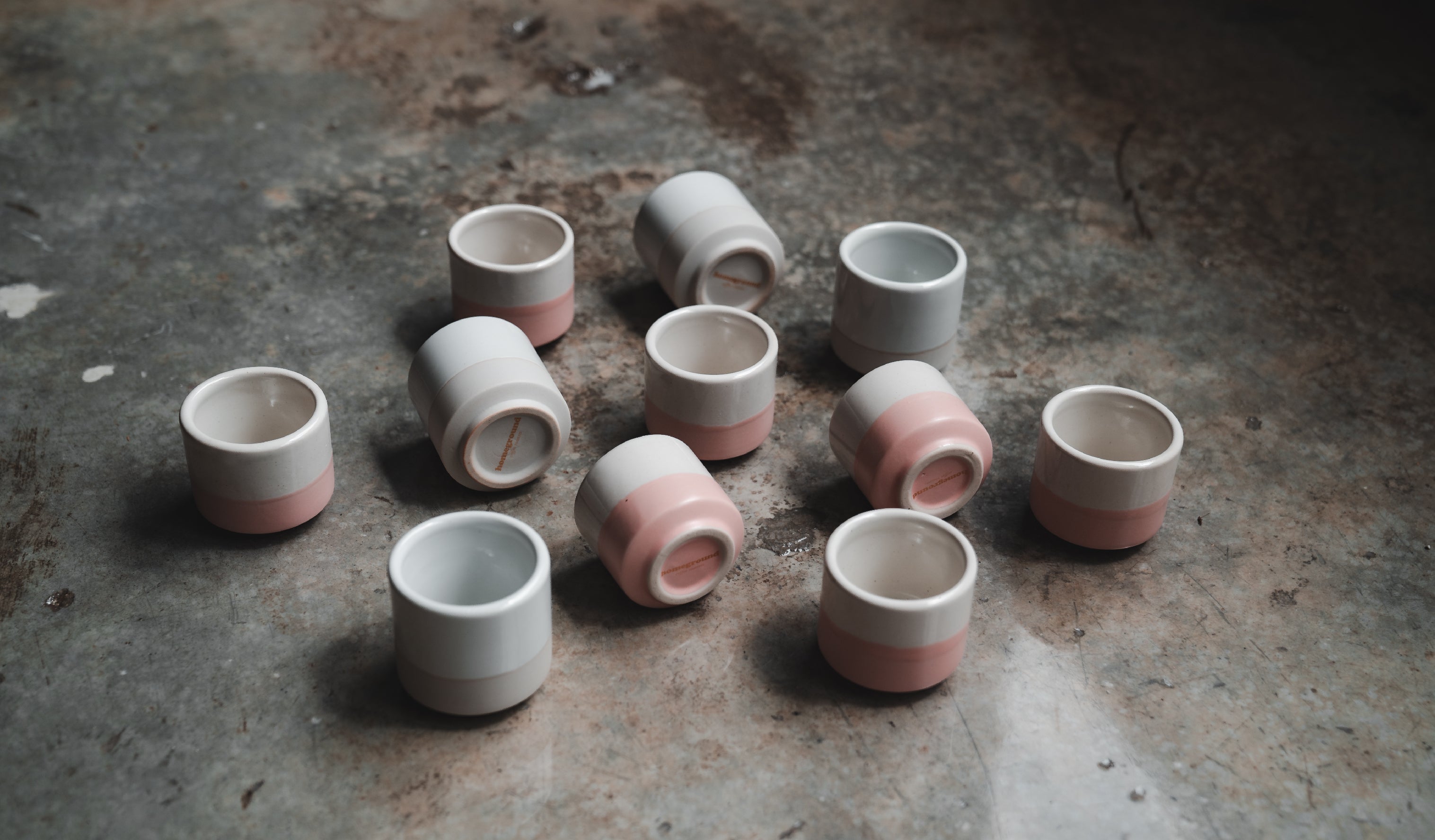
When linking the four basic tastes to colours, researchers found some interesting matches. Sweetness is linked to pink. Sourness, which may include acidity, is linked to green and yellow. Saltiness is connected to white, while bitterness is associated with black.
There are three methods in which cross-modality is commonly effected:
Priming: When a prime presented in one sensory modality influences responses to a target in a different sensory modality. E.g., since pink is associated with sweetness, drinking from a pink cup may enhance the perception of sweetness.
Contrast: An extension of priming is when contrasting colours affect our responses to a target. For example, since brown is associated with bitterness, drinking from a white cup highlights the brown colour of coffee which could make the bitter taste more pronounced.
Simultaneous Contrast: When a strong or contrasting colour is placed next to the prime, it can make the prime appear less intense, reducing its effect on the sensory response. E.g., A cup coloured brown on the inside potentially reduces the bitterness in the beverage.

The Use in Coffee
Since cross-modal perception is a common part of our daily experiences, studies on this topic includes the influence of coffee as well.
Among the three methods previously mentioned for influencing cross-modality, Van Doorn et al. (2014) demonstrated that contrast is effective, while simultaneous contrast is not. Additionally, Carvalho and Spence (2019) explored this topic further and found that priming using the colour of the cup significantly impacted the perception of coffee.
Various findings note that pink is associated with sweetness, while green is associated with acidity. Yellow is found to increase both sweetness and acidity ratings, an odd exception likely due to cultural differences since the colour is often associated with acidity, some tropical countries also interpret yellow as sweet. Locally, our sweet jackfruits, mangoes and durians all come to mind when we think of yellow fruits.
With this in mind, selecting a right cup to influence a customer’s coffee drinking experience becomes a whole lot easier, and there is no right answer – it is not always to choose a pink cup!
While sweetness is preferred generally, some coffees may need their acidity to be highlighted. Others might require their intensity and body to be the main focus for the coffee drinker.
Incongruence
A word of warning, however, that implementing cross-modality in our cup selection does not come without risks.
Carvalho and Spence's research also observed that when incongruent conditions were introduced, the results were far from ideal.
For the slightly brighter coffee served in a pink cup, the cross-modal perception emphasised the contrasting attribute negatively. Acidity was rated the highest, while sweetness was the lowest, making this combination the least preferred among the coffees presented. Similarly, the sweeter coffee served in a green cup received significantly lower sweetness and acidity ratings compared to the others and was also the least liked.
Although the impact of colour on coffee is clear, finding the right balance between emphasising specific attributes and maintaining congruence appears to be the key to mastering this challenging decision once and for all.
Why This Matters for Singapore’s Coffee Lovers
In a city obsessed with specialty coffee, every detail counts. The right coffee cup does more than look good on Instagram. It enhances the flavours and makes your daily coffee special.
Next time you order a flat white or a filter coffee, notice the cup colour. That subtle hint of pink? It’s not just design; it’s science.
Read Also --
tags: Specialty coffee in Singapore, filter coffee, espresso-based coffee, coffee cups, coffee flavour, cup colours
Journal Archive
Milk in World Barista Competitions
An overview of milk concentration methods in coffee competition, focusing on freezing techniques that enhance milk's qualities for great coffee beverages.
How Coffee Cup Colours Affect Your Drinking Experience
Cross-modal perception of colours on the taste of coffee
Learning to enjoy more
Same Coffees Everywhere, All at Once
Why do local specialty coffee shops serve the same coffees?
A study of unexpected coffee production nations
A low down on using puck screens for espresso machines